neue Serie57® Release
The origins of Akzidenz-Grotesk remain somewhat obscure. It has many parents and countless daughters. H. Berthold, type foundry in Berlin, did not invent AG (as it is called for short), but made it known worldwide. Over decades, new members of the family were added, usually labeled “in-house design”, i.e. without crediting an artist or craftsman. Different weights, cuts, and versions can be found in the foundry’s catalogs and specimens, not necessarily following any particular logic or system.
The new beginning after the war was heavily influenced by the work of Günter Gerhard Lange (GGL), who started there as a freelancer in the early 1950s, then became Artistic Director. He combed through Berthold’s range of fonts, designed new ones or commissioned them, and supplemented the existing catalog.
After the war, Swiss typography had become the world-wide style. It used Akzidenz-Grotesk almost exclusively, making it a bestseller. When, due to high demand, AG had to be adapted for Linotype matrices, GGL took on the task. He left the sizes 6 to 12 point pretty much untouched, but took the opportunity to completely redraw the sizes 14 to 48 point, which were still only available for manual typesetting. The Linotype fonts were available from 1957, hence the name. The new weights were not available until 1959 — after all, the development of a new metal typeface at that time took several years, from the first drawings, through cutting punches and matrix production, to casting the type.
Each size had to go through this process individually, unlike today, when a digital template can be scaled to any size.
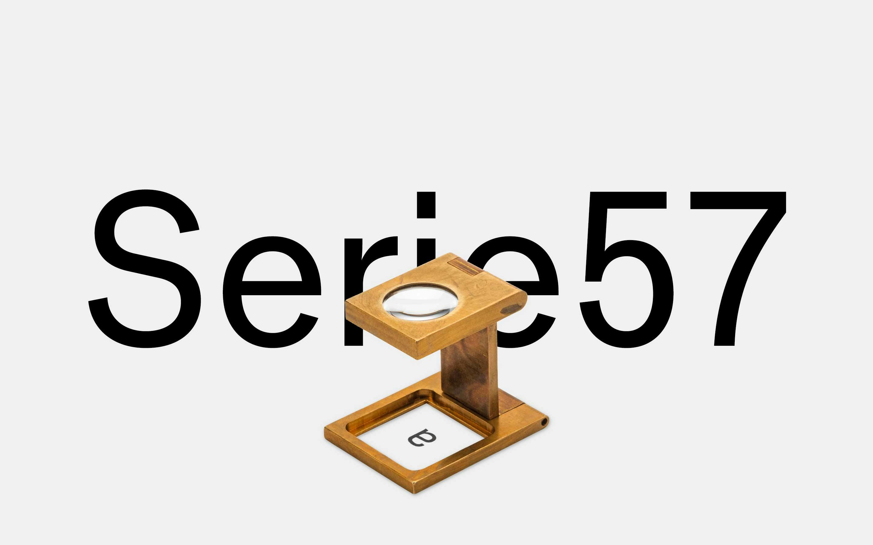
GGL’s new design clearly shows the imprint of its time. While the original AG is quite lively, with clear contrast between horizontal and vertical strokes, rather tight oval shapes, and almost closed counters in e, c, and s with terminals at varying degrees, the new AG Series 57 from 14 point upwards looks much more austere, tidier, and less nostalgic. Its x-height is taller, the curves are less oval and the counters more open. The lower case a encapsulates the new style: The tail at bottom right is gone, the belly to the left is much tighter and the head is more erect.
The new typeface clearly shows that it was created under the influence of the Zeitgeist. In 1957, Neue Haas Grotesk had been introduced as Haas/Stempel’s response to the success of the “old” AG. It had eliminated all the peculiarities of its model and — as the typeface with-out character — became a world-wide success under the name Helvetica. That same year the first weights of Univers were released. Right from the onset it had been planned and drawn as a system of several weights and widths by Adrian Frutiger.
Akzidenz-Grotesk’s irregularities — today once more seen as strength of character — did not fit into the new, sober world of the post-war period.
This “progressive” spirit of the time was also evident in other trendsetting designs of the time: 1955 the world first saw the Citroën DS (Déesse: the goddess) which went on sale in 1957. It made all other cars look old overnight. The landmark for the 1958 World’s Fair in Brussels was the Atomium — a building made entirely of shiny metal.
The weights of AG Serie 57 from 14 point up would have had what it takes to become the basis of a new, more neutral typeface. However, Berthold never featured them in any of their specimens. It was only when we discovered them in a mislabeled case and looked them up in an old specimen, we remembered that the form differed considerably from the other weights. All this time, we hadn’t looked closely enough and hadn’t noticed that AG Serie 57 could be the basis for an independent family, starting with the 14-point cut.
This historical oversight is our good fortune: now we have a new typeface of our own, born in the digital world, but with a pedigree that goes back to the 19th century. Amidst the many Helvetica copies, imitations, and clones, neue Serie57® is a credible new typeface that can call on a long line of ancestors.